Presentations and posters are a key part of any profession. They are a way to share information to clients, colleagues, or the public in a simple visual format. Learn how to organize, format, and present your presentation or poster.
Presenting vs. Writing
Presentations are meant to convey much of the same information as a written report – but that does not mean you slap some figures and quotes on some slides and it makes a good presentation. You need to think carefully about the content and what you will say versus what is in writing on the slide.
Some of the key differences in presenting vs. writing are:
- Brevity – a presentation is generally shorter than a written report. You cannot get all the information in your report to fit into a presentation – so don’t try to. What you need to do is to select only the most valuable and important information. What are you trying the communicate and what does the audience really need to know in order to make the right decisions? It’s not easy cutting out what you feel are some really cool things about your work, but if it is not something the audience needs to know then leave it out. You can always refer them to the written report (or to yourself) if there are questions.
- Display – Screen space is different than paper space. While paper tends to be black and white, on the screen you can make use of colors and even animations to make your presentation pop. But don’t get too carried away and make a wild color scheme a distraction. Also, make sure that the font is readable for the people in the back of the room (yes, people really do want to be able to read the axis of a graph). So, in general, make sure no font size less than 12pt anywhere. For text in the presentation use at least 18 pt.
- Balance of Text and Graphics – Don’t use a lot of text on your slides and don’t read your slides to the audience! If you use too much text you might as well make it a written report and then what is the point of you presenting. The text on the slides should be the most important summary information (you don’t even have to use complete sentences). Graphics are also a great way to convey information. In general, you want at least one graphic on every slide.
- Delivery – It’s not just the words you say but also how you say them. The nonverbal communication in your presentation can make a large impression on the overall quality of the presentation. Try to be calm, confident, and engaging with the audience. Make sure that your presentation helps the audience follow your train of thought and grasp the key concepts.
- Engagement – In a presentation you want to engage with the audience. This means interacting with the audience (eye contact) and providing a presentation that entices them. Often you can begin a presentation with a short “hook” that grab’s the audience’s attention (anecdote, story, questions, applicable joke, etc.). This helps to engage the audience but also can be used to express the significance of the presentation.
Organization of the Presentation
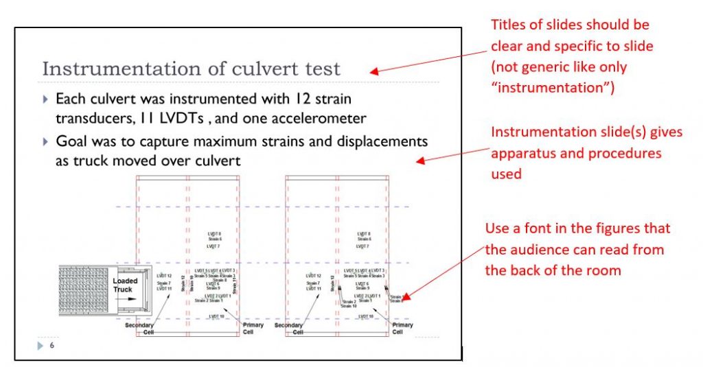
Most presentations follow a fairly standard organization listed here. However, there are cases where different organizations need to be used so be sure to know what your audience needs. In making your slides you need to make sure that each slide conveys one main point usually described by the slide title.
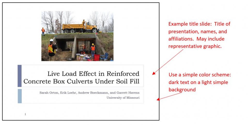
The first slide is usually the title slide. It does much the same job as the cover page in a written report. You should give the title of your presentation, who is presenting (and who worked on the project), and affiliations (such as the company you work for or who is sponsoring the project). While presenting the title slide (or adding another after it) you may include your “hook” to help engage the audience and grab their attention.
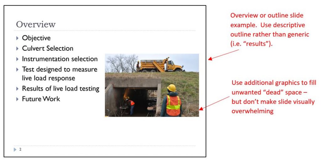
The next slide generally gives an outline. It does much the same job as an abstract or a table of contents in a written report. You should let the audience know where you are going. Outline the project and the results that will be presented. Don’t use a generic outline, but tailor it to your presentation.
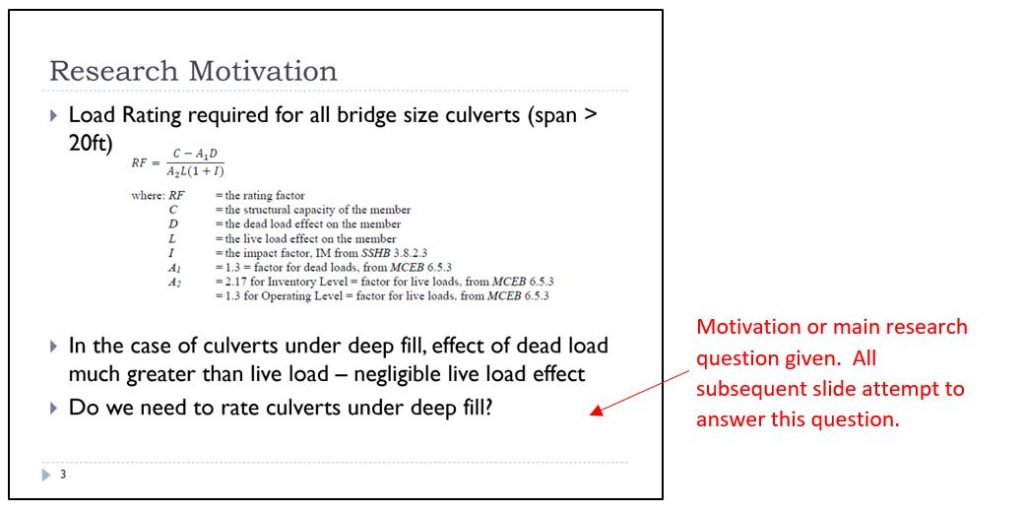
The third slide generally sets the stage for the audience. Why do they want to know about what you are presenting? What are the objectives of the project? What are the questions you are going to answer? This is probably your most important slide. Make sure the information on this slide ties the rest of your presentation together (every slide should be supporting the motivation and objectives and the conclusions should answer the questions raised here).
If you are reporting on the results of an experiment you can describe the apparatus and procedures as well as any standards followed. If you are presenting a design report you can describe the requirements/constraints of the design problem and design goals.
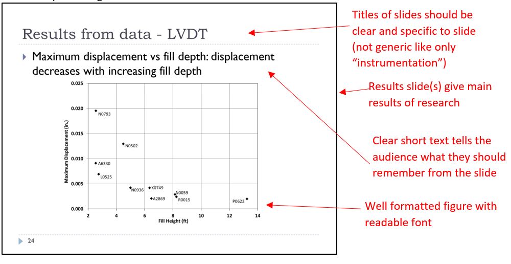
The results section simply states the results of the design or laboratory experiments. In an experimental or laboratory research presentation the results will typically consist of the results of the calculations and/or experimental data. This is where you can put in your most important tables and figures that answer your research questions/objectives. Use limited text that highlights what the audience should take away from the graphic. You can explain in your speech the details. You should also give the audience an understanding of the methods used in analyzing your experiment. In a design presentation the results typically consist of calculation work done in interpreting the design. You don’t have to show all the calculations in a presentation, but you should give the audience an understanding of how you arrived at your design.
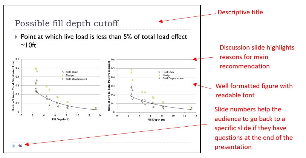
This is the heart of your presentation. You should present what you determined in the design or learned from the experiment. In an experimental or laboratory research presentation, you should analyze your results by discussing the data and interpreting your results. State the significance of your results clearly, and compare your results with theory or other work. Be sure to use quantitative comparisons in your discussion. Indicate if the results support the underlying theory or contradict it. In a design presentation, you should highlight the main recommendations of the design or compare the design with other alternatives. This may be where you evaluate the value vs. cost of the proposed design. The audience should have a clear understanding of why this design was chosen.
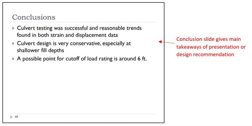
Based on the data you presented to the audience tell them what they should have learned or should do with that information. These conclusions should answer the motivations presented on the third slide. Conclusions are usually presented with a bulleted list on one slide (if you can’t fit it on one slide – then you need to work on focusing your presentation and weeding out extraneous information). Recommendations can be on the same or a separate slide.
Format
Font Size
Make sure that the audience can read everything on your slide from the back of the room. The audience will feel frustrated if you show a graph were the axis values are too small to read. Generally, fonts will be between 18 pt and 40 pt. For axis numbers you may go down to 12pt but not any smaller. Try not to use any odd fonts. Keep to the standard Arial, Calibri, Helvetica or Times.
Text Density
Don’t put a lot of words on your slide. Generally, slides will have fewer than 100 words (and that is only for a conclusion slide that can be more word heavy). Most slides will have only 10 to 30 words, some slides may have no words on them. Don’t use complete sentences. Rather used bulleted lists or short phrases. Do not read your slide to the audience. The point of a presentation is that you are talking to the audience, so say something they cannot read.
Graphics
Follow the format suggestions for Figures, Tables, and Equations that you would use in a written report. You don’t have to number the graphics, but you do need to make sure they look good. If you did not produce the graphic be should to include a citation. Make sure all graphics appear clear and sharp. Don’t use too many graphics to too complicated of a slide. Too much will overwhelm the audience.
Consistency
You may think using lots of different fonts and other visual makers makes the presentation more interesting, but the key here is to keep things simple. Use visual markers (such as bold or italic font, different colors, or arrows and stars) to highlight key information on a slide, but don’t use so many that it becomes a distraction to the audience. Also, be consistent in your use. If you use one type of arrow to highlight something, use the same arrow throughout in the same way.
Colors
One of the benefits of a presentation is that they are in color, but you want to be careful with the use of color. PowerPoint has a wide array of colorful backgrounds that seem interesting, but don’t be tempted by these. In general, the background should be light, uniform, and dull. Dark text on light simple backgrounds are easier for the audience to read. Use colors sparingly to highlight important information, such as some text in red. Be careful, some colors (like yellow) show up well on a computer monitor but do not project as well. If possible do a trial run and try projecting your slide in the room you will be presenting in to check colors and make sure font is readable.
Space
Slides give you a good amount of space and you want to make sure that you fill it without being overly crowded. Work with your presentation to make sure each slide is visually balanced and appealing. Also try to keep the same format through many slides.
Transitions and Animations
In PowerPoint, slide transitions and other animations (flying in text) can be used. These help the visual appeal of the presentation, but like colors, they should be used sparingly and consistently. For example, if you choose one method for a slide transition keep the same method throughout the presentation. If you want to animate the text (flying it in) then use the same method throughout. Try not to use too many animations (You don’t need a new fly in for every bullet. Its ok to put them all up at once and talk through them one by one).
Slide Titles
Slide titles are good to use. They help the audience know what the slide is about. But don’t use a lot of repetitive generic titles like “results.” Instead, use a title that describes the content on each slide. Each slide should convey only one main point.
Slide Size
Slide sizes are either 4:3 or 16:9. The squarer 4:3 size used to be the standard, but now more and more projectors use the 16:9 format. Know the room you will be presenting in and choose the correct size. If you use a 16:9 slide size and the projector is a 4:3 size, then your slides will not be projected as large.
Speaking
One of the main differences between a presentation and a written report is that you will be speaking directly to the audience. A good presentation has a speaker that is effective, engaging, and confident. Practice is the best way to improve your speaking. Practice in your home. Get friends and family to be an audience. Practice in the room you are to present in to feel more familiar with it. Beyond practice, below are some suggestions for improving your speaking.
- The presentation should be formal, specific, and complete. You need to use professional technical language. In some cases, the presentation may be less formal and more interactive. Know your audience.
- Engage your audience. Make eye contact with them, don’t stare at your screen. Try walking around the room (if possible).
- Vary your pace and tone in the presentation. You don’t want your presentation to be one long monotone monologue. Make appropriate pauses to let the audience think about a particular point. Ask questions and get the audience to engage if possible.
- Use spoken transitions between slides so that the audience can follow your train of thought and the logic of your presentation.
- Speak loud enough to be heard at the back of the room. If the room is too large consider using a microphone. There is nothing more disengaging to an audience than not being able to understand the speaker. If your language skills are poor, slow down and speak as loudly (but don’t shout at them) and clearly as possible.
- Avoid distractions and filler words. Try not to use “um” and “like”. If you are having trouble remembering what to say, a pause is ok.
- Pay attention to your body language. You should appear to be calm and confidant in your presentation. Portraying confidence is the best way to get the audience to trust in your conclusions or design recommendation. Don’t fidget. Keep your hands to your side or use them for gesturing occasionally.
- Laser pointers are good for getting the audience to focus on a particular item in the slide, but don’t use them all the time.
- Know what you are going to say ahead of time, but don’t memorize a speech. You want your presentation to feel natural and flowing. You need to make slight modifications to what you are saying based on the audience reactions.
- Watch the audience. If it is clear they are disengaging or looking confused try to adjust your talk to address them. You can try asking questions or telling a joke.
- Speaking in public can make even the most seasoned speakers feel a bit nervous. The key is to find the tips and trick that allow you to calm your nerves and deliver a confident presentation. Practice is one of the best ways to become more confident, but also mental preparations and tricks can help distract your mind from your fears and focus back on the presentation. A quick Google search will provide many websites with suggestions for improving confidence in public speaking.
Posters
PowerPoint can be used to create a poster. You simply need to adjust the size of the slide to the required (or allowed) size of the poster. Below are some general rules on a poster.
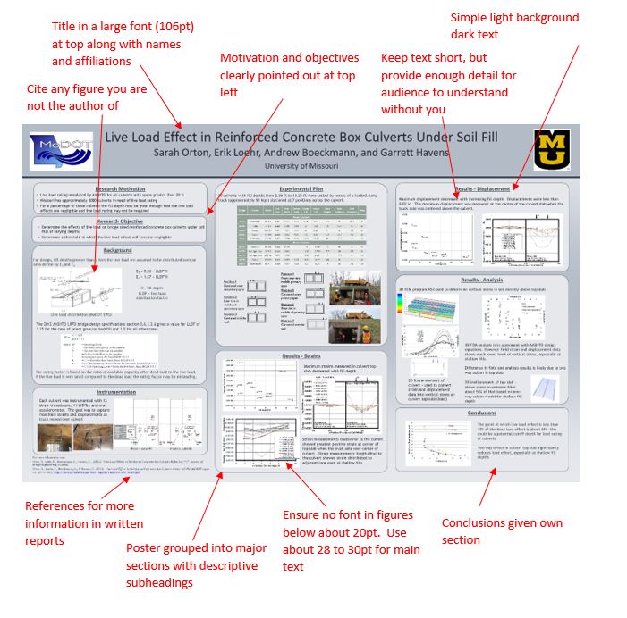
- Be brief in the information. Like in a presentation only include that which is needed to inform the audience on what they need to know to make a decision or understand a conclusion. Unlike a presentation, you may not be there to explain everything, so make sure there are some details.
- Use color in the poster, but be sparing with it. Keep to only a few complimentary colors and make sure the text is a different color (i.e. light text on a dark background or dark text on a light background)
- Section your poster into different areas (like the different sections of a presentation). The most important information (motivation and objectives) should go in the upper right corner.
- If you use any graphics that you did not produce, make sure they are cited.
- Be sure to include your name and affiliation (also perhaps contact information) in case the audience wants more information. You may also provide references to associated written reports.
- Like in a presentation you want to keep text short. Use key words and phrases and bulleted lists. However, unlike a presentation you may need to use more text in the poster as you may not be there to explain everything.
- Make sure all font is readable when the poster is printed.
- If you are presenting your poster be ready with a 30-45 second “elevator” speech to convey the main point of your poster. If the audience member is interested, you can go through more details.